Letters of the Russian Alphabet
Below are examples of how a scribe would have formed the Russian letters. Use these pages to help decipher hard to read letters or discern between letters that may look alike. For an explanation of the vocabulary used to explain how each character is formed, see Describing the Letters. For tips and resources for using the Russian keyboard See Typing in Russian.
Use the buttons to jump to a specific letter to study.
Ѣѣ
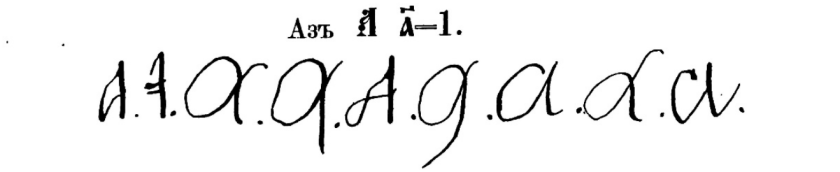
Аа | Name: “ah” English equivalent: a Pronunciation: a in “father” |
А
"(Name) Ah, (Sound) Ah, (Example) акт" |
| The handwritten uppercase A is similar to its typeface counterpart, as well as the typeface Latin A. It is formed by making an upward, slanted stroke from the baseline to the headline, followed by a similar stroke in the opposite direction. A crossbar is added around the midline. | 
|
| The handwritten lowercase а also resembles its Latin counterpart. It is formed by creating a bow between the baseline and the midline, followed by a minim from the midline to the baseline, which generally curves to lead into the next character written. | 
|
Examples:

| 
|
Variants:

Бб | Name: “beh” English equivalent: b Pronunciation: b |
Б
| ||
| The handwritten uppercase Б is similar in shape to a lowercase Latin b. It is formed by creating a downward stroke from the headline to the baseline, which then loops back around to form a bow on the right side of the original stroke. A headstroke or cap is then drawn from left to right along the headline. | 
|
| The handwritten lowercase б differs from its typeface form by placing the bow to the left of the ascending stroke, rather than to the right of the ascender. It is formed by creating a bow between the baseline and the midline, followed by an ascending stroke from the baseline to the headline, which then curves to the right along the headline. This letter is should not be confused with one variation of the lowercase д, which instead curves to the left between the midline and the headline. | 
|
Examples:

| 
|
Variants:


Вв | Name: “veh” English equivalent: v Pronunciation: v |
В
"(Name) veh, (Sound) v, (Example) вдова" | ||
| The handwritten uppercase B is similar to its uppercase typeface counterpart, as well as the Latin B (though the sound the letter makes is different). It is formed by creating a downward stroke from the headline to the baseline, looping back to the headline, and then forming two semi-bows, one from the headline to the midline and another from the midline to the baseline. | 
|
| The handwritten lowercase в can be compared to the Latin b (though the sound the letter makes is different). It is formed by starting below the midline (possibly as low as the baseline, though this depends on where the preceding letter ends) and creating an ascender, looping from right to left when reaching the headline. After the loop, a downward stroke is made from the headline to the baseline, followed by a bow to the right of the previous stroke between the baseline and midline. | 
|
Examples:

| 
|
Variants:


Гг | Name: “geh” English equivalent: g Pronunciation: g in “good” |
Г
"(Name) geh, (Sound) g, (Example) город" | ||
| The handwritten uppercase Г is comparable to its typeface counterpart in shape. It is formed by creating a downward stroke from the headline to the baseline, which usually curves slightly upward to the left. A headstroke or cap is added from left to right along the headline. The main difference between this letter and its typeface version is that the cap extends on both side of the body of the letter, rather than just the right side. | 
|
| The handwritten lowercase г differs significantly from its typeface counterpart. It is formed by starting near the midline, creating a rising stroke up to the midline, and dropping down to the baseline in a single minim. The letter ends by curving up into the following character. The handwritten character is almost like a mirror image of the typeface version. This letter does not begin with a hook, which differentiates it from the lowercase л. This letter is also usually more rounded than the lowercase л, though this depends on the scribe. | 
|
Examples:

| 
|
Variants:


Дд | Name: “deh” English equivalent: d Pronunciation: d |
Д
"(Name) deh, (Sound) d, (Example) дом" | ||
| The handwritten uppercase Д is very similar to the Latin D and is much more curved than its typeface counterpart. It is generally formed by creating a downward stroke from the headline to the baseline, looping from the left side back to the right and rising again to create a semi-bow, closing at the top of the original stroke. This letter often includes a flourish at the end of the semi-bow, as seen in the examples below. | 
|
| The handwritten lowercase д comes in two forms. The first is similar to the Latin g (though the sound is different). It starts with a bow between the baseline and midline, followed by a downward stroke from the midline past the baseline, forming a descender. The descender then loops from right to left back to the baseline, where the letter can be connected to the following character. | 
|
| The second variation of the lowercase д also begins with a bow, but the following stroke leads from right to left, rising from the midline to the headline in an ascending curve. This letter is not to be confused with the lowercase б (which instead curves to the right above the midline). | 
|
Examples:

| 
| 
|
Variants:


Ее | Name: “yeh” English equivalent: ye/e (after consonants) Pronunciation: ye in “yellow” |
Е
"(Name) yeh, (Sound) yeh, (Example) еврейский" | ||
| The handwritten uppercase Е is written like the Latin cursive E (though the sound is not exactly the same). It is formed by creating a semi-bow to the left, starting at the headline and going down to the midline, followed by another semi-bow from the midline to the baseline. | 
|
| The handwritten lowercase е is very similar to its Latin counterpart (though the sound is not exactly the same). It is formed by creating a loop between the baseline and the midline, starting at the left and dropping to the right. | 
|
Examples:

| 
|
Variants:


Ёё | Name: “yo” English equivalent: yo Pronunciation: yo |
Ё
"(Name) yo, (Sound) yo, (Example) ребёнок" | ||
| The handwritten uppercase Ё is written much like the Latin cursive E (though the sound is different). It is formed by creating a semi-bow to the left, starting at the headline and going down to the midline, followed by another semi-bow from the midline to the baseline. The letter is completed by adding two dots on top of the letter (above the headline). The uppercase Ё is very uncommon in handwritten documents from the pre-Soviet period. | 
|
| The handwritten lowercase ё is very similar to the Latin e. It is formed by creating a loop between the baseline and the midline, starting at the left and dropping to the right. This letter includes two dots on top of the letter (just above the midline). | 
|
It is extremely common for the two dots above this letter to be omitted in handwritten documents. Be aware of this as you search for surnames or given names that include this letter, as they may be written without the two dots, making it look like a e has been written instead of a ё. Russian speakers understand from context that it is really a ё.
Examples:

| 
|
Variants:

Жж | Name: “zheh” English equivalent: zh Pronunciation: z in “azure” |
Ж
"(Name) zheh, (Sound) zh, (Example) жена" | ||
| The handwritten uppercase Ж is written with more curvature than its typeface counterpart. It is initiated by creating a semi-bow to the right from the headline to the baseline. The next stroke rises in a slant to the right back to the headline, followed by a straight stroke from the headline to the baseline. This stroke is followed by one that rises to the headline at a slant to the right, curving to the right and bending back down to the baseline in a semi-bow to the left. | 
|
| The handwritten lowercase ж is written much like its uppercase equivalent, starting with a semi-bow drawn to the right, this time between the baseline and the midline. This is followed by an upward, slanted stroke from the baseline to the midline, which then drops in a minim straight from the midline to the baseline. The following stroke rises from the baseline to the midline and curves into another semi-bow to the left. | 
|
Ж is the one of the most varied letters in the Cyrillic alphabet, so it is important to both review the examples and variants of this letter and keep an open mind to how the scribe may have represented the letter.
Examples:

| 
|
Variants:


Зз | Name: “zeh” English equivalent: z Pronunciation: z |
З
"(Name) zeh, (Sound) z, (Example) законная" | ||
| The uppercase handwritten З is written like the Arabic numeral 3. It is formed by creating two semi-bows to the right—the first from the headline to the midline and the second from the midline to the baseline. | 
|
| The handwritten lowercase з is written like a handwritten Latin z. It is formed by creating a semi-bow to the right reaching from the midline to the baseline, followed by a descender which loops from right to left and rises back above the baseline. Occasionally this letter is written to look more like an Arabic numeral 3, in which case it is not a descender, but rather ends at the baseline (see examples). | 
|
Examples:

| 
|
Variants:


Ии | Name: “ee” English equivalent: i Pronunciation: i in “trampoline” |
И
"(Name) ee, (Sound) ee, (Example) имя" | ||
| The handwritten uppercase И is written like an uppercase Latin U (though the sound is different). It is formed by creating a downward stroke from the headline to the baseline, after which the line curves upward until it again reaches the headline. When the headline is reached, another stroke is created straight down from the headline to the baseline. | 
|
| The handwritten lowercase и looks very similar to the Latin u (though the sound is different) and its uppercase equivalent. It is composed of two minims reaching from the midline to the baseline, connected at the baseline. | 
|
Examples:

| 
|
Variants:


Йй | Name: “ee-kratkoye” English equivalent: y Pronunciation: y in “boy” |
Й
"(Name) ee-kratkoye, (Sound) y, (Example) район" | ||
| The handwritten uppercase Й is similar to the letter И and to an uppercase Latin U (though the sound is different). Like the typeface version of this letter, a small, curved line—called a breve—is added on top of the letter (above the headline). The uppercase rendition of this letter is uncommon in historical documents. | 
|
| The handwritten lowercase й also looks very similar и and to the Latin u (though the sound is different). It is composed of two minims reaching from the midline to the baseline, connected at the baseline. The lowercase version of the letter also includes a breve, this time just above the midline. The breve may also be written on its side, depending on the scribe (see examples). | 
|
Examples:

| 
|
Variants:

Кк | Name: “kah” English equivalent: k Pronunciation: k |
К
"(Name) kah, (Sound) k, (Example) крестьянка" | ||
| The handwritten uppercase К looks very similar to its typeface and Latin counterparts. While some scribes begin the letter by creating a small upward stroke above the midline towards the headline, more important is a longer stroke from the headline to the baseline. The line is then curved from left to right, crossing the previous stroke around the midline and rising all the way to the headline to the right of the previous stroke. An additional curve is added from the midline to the right and down to the baseline. | 
|
| The handwritten lowercase к is written much like its uppercase equivalent. It begins with a small upward stroke between the baseline and the midline, followed by a minim straight down from the midline to the baseline. The following stroke rises from the baseline to the right, curving under the midline. An additional stroke is made from the midpoint of the letter to the right, which curves down to the baseline. | 
|
Examples:

| 
|
Variants:


Лл | Name: “el” English equivalent: l Pronunciation: l |
Л
"(Name) el, (Sound) l, (Example) литургия" | ||
| The handwritten uppercase Л is written by making a hook, followed by an upward stroke from the baseline to the headline at a slant to the right. Another stroke is made from the headline to the baseline. This letter is less square than its typeface counterpart, as the headstroke of the letter is eliminated. | 
|
| The handwritten lowercase л is written much like its uppercase equivalent and is composed of an initial hook followed by a stroke up to the midline, which then drops back to the baseline in a single minim. This letter can be easily confused with the lowercase г, which is similar in size and shape but does not include a hook. The lowercase л is usually more angular than the lowercase г as well. | 
|
Examples:

| 
|
Variants:


Мм | Name: “em” English equivalent: m Pronunciation: m |
М
"(Name) em, (Sound) m, (Example) мещанин" | ||
| The handwritten uppercase М is formed starting with a hook on the left, followed by an upward stroke from the baseline to the headline. The next stroke drops from the headline to the baseline, curving up to reach the headline again. A final stroke completes the letter by dropping again from the headline to the baseline. This letter resembles the typeface М, but it is rounded at the baseline rather than being angular like its typed form. | 
|
| The handwritten lowercase м is also similar to its typeface counterpart. Like the uppercase version of this letter, the lowercase м begins with a hook and is composed of two minims, this time between the midline and the baseline, which are connected at the baseline. This letter can sometimes be confused with the lowercase и, (which also has two minims connected at the baseline, but does not include a hook). | 
|
Examples:

| 
|
Variants:


Нн | Name: “en” English equivalent: n Pronunciation: n |
Н
"(Name) en, (Sound) n, (Example) невеста" | ||
| The handwritten uppercase Н is similar to the Latin H (though the sound is different). It can be formed by first making a small upward stroke above the midline to the headline and always includes a straight stroke from the headline to the baseline. This line curves from left to right and rises to form a similar curl from right to left between the midline and headline. Once the stroke reaches the headline, it drops from the headline to the baseline. This letter can also be written by making two parallel strokes from the headline to the baseline, connected by a crossbar. | 
|
| The handwritten lowercase н is similar in shape to the uppercase Latin H (though the sound is different). It is written by creating two parallel minims between the midline and the baseline, which are then connected with a crossbar. Some writers connect the first minim to the second by tracing the crossbar towards the midline and then forming the second minim, which may cause this letter to be confused with the lowercase п. When the two minims are connected closer to the baseline, н can also be confused with the letter и. | 
|
Examples:

| 
|
Variants:


Оо | Name: “oh” English equivalent: o Pronunciation: o |
О
"(Name) oh, (Sound) oh, (Example) общество" | ||
| The handwritten uppercase О resembles its typeface counterpart and Latin equivalent. This letter consists of one large bow, filling the space between the baseline and the headline. | 
|
| The handwritten lowercase о is very similar to the uppercase О, as well as their Latin counterparts. It is a bow formed between the midline and the baseline. | 
|
Some scribes do not close the bow of the letter о completely. See the examples and variants below for a few instances where that is the case.
Examples:

| 
|
Variants:
The Cyrillic О and omega (which is found in Old Church Slavonic and early Russian texts) represent the same sound. Thus, some variants of omega are included below.


Пп | Name: “peh” English equivalent: p Pronunciation: p |
П
"(Name) peh, (Sound) p, (Example) перед" | ||
| The handwritten uppercase П resembles the symbol for mathematical pi (π). It is formed by creating two downward strokes from the headline to the baseline, which may curve outward to opposite sides (as seen in the example to the right). A headstroke or cap is added from left to right, following the headline. Like the headstroke for the letter Г, the headstroke extends past the edge of the letter to both sides. | 
|
| The handwritten lowercase п is similar in shape to the Latin n (though the sound is different). It is formed by creating two minims between the midline and the baseline, which are connected at the midline. Some scribes write a horizontal line above this letter to help the reader differentiate between п and и (which is connected at the baseline instead of the midline). | 
|
Examples:

| 
|
Variants:


Рр | Name: “ehr” English equivalent: r Pronunciation: r (trilled or rolled) |
Р
"(Name) ehr, (Sound) rolled r, (Example) родился" | ||
| The handwritten uppercase Р, like the typeface version of the letter, resembles the uppercase Latin P (though the sound is different). It is formed by creating a downward stroke from the headline to the baseline, curving to the left at the baseline. A semi-bow is then drawn to the right from the headline to the midline, where the semi-bow may connect with the principal stroke (this depends on the scribe; see examples below). | 
|
| The handwritten lowercase р is written by making a downward stroke from the midline down to below the baseline (creating a descender), which is then traced back to the midline, where a connecting line is drawn to the right before dropping in a minim from the midline to the baseline. This letter resembles a Latin p (though the sound is different) with the bottom of the bow left open (some scribes do write a closed bow in place of the final minim; see the examples below). | 
|
Examples:

| 
|
Variants:


Сс | Name: “ess” English equivalent: s Pronunciation: s |
С
"(Name) ess, (Sound) s, (Example) свидетель" | ||
| The handwritten uppercase С is similar to its typeface counterpart as well as the Latin C (though it only makes the ”s” sound, not the hard ”k” sound of the Latin C). It is a semi-bow to the right, starting from just below the headline and curving upward to touch the headline before dropping to the baseline and curving back upward slightly. Additional flourishes may be added to this letter, depending on the scribe. | 
|
| The handwritten lowercase с also resembles the Latin c (though, again, it only makes the “s” sound of the Latin c), as well as its uppercase counterpart. It is written by forming a semi-bow to the left between the midline and the baseline. | 
|
Examples:

| 
|
Variants:


Тт | Name: “teh” English equivalent: t Pronunciation: t |
Т
"(Name) teh, (Sound) t, (Example) таинство" | ||
| The handwritten uppercase Т is created by forming three parallel strokes from the headline to the baseline. The strokes on either side may curve outward slightly. A headstroke or cap is then added from left to right, following the headline. | 
|
| The handwritten lowercase т looks similar to the Latin m (though the sound is different). It is not to be confused with the lowercase Cyrillic м. The т is written by creating three minims between the midline and the baseline, which are connected at the midline. This letter may also be written with a horizontal line drawn across the top, which is meant to emphasize its identity as т rather than ш (which is composed of the same number of minims and connected at the baseline). | 
|
Examples:

| 
|
Variants:


Уу | Name: “oo” English equivalent: u Pronunciation: u in “rude” |
У
"(Name) oo, (Sound) oo, (Example) уезд" | ||
| The handwritten uppercase У is similar to its typeface counterpart. It is formed by creating a downward stroke from the headline to the midline, which curves and rises back to the headline. A downward stroke from the headline to the baseline follows, which then curves back to the left. | 
|
| The handwritten lowercase у resembles the lowercase Latin y (though the sound is different). It is written by creating two minims between the midline and the baseline, connecting them at the baseline. The second minim drops down below the baseline to create a descender, which then loops from left to right, rising back above the baseline. | 
|
Examples:

| 
|
Variants:


Фф | Name: “ef” English equivalent: f Pronunciation: f |
Ф
"(Name) ef, (Sound) f, (Example) фамилия" | ||
| The handwritten uppercase Ф is formed by creating a downward stroke from the headline to the baseline, which sometimes curves slightly to the left. A full bow is added on either side of the first stroke, filling the space between the headline and midline on either side of the line. These two bows represent the one large bow in the typeface version of the letter. | 
|
| The handwritten lowercase ф resembles its uppercase counterpart. It is written by first forming a bow between the midline and the baseline, which is followed by a descender from the midline down to below the baseline along its right side. A second bow of the same size is formed on the right side of the descender. | 
|
Examples:

| 
|
Variants:


Хх | Name: “kha” English equivalent: kh Pronunciation: ch in “Bach” |
Х
"(Name) kha, (Sound) kh, (Example) христианский" | ||
| The handwritten uppercase Х is similar in shape to its typeface counterpart, though it is more curved. It is formed by creating two semi-bows—the first to the right and the second to the left—from the headline to the baseline, which touch at the midline. | 
|
| The handwritten lowercase х resembles its uppercase counterpart. It is also written by forming two semi-bows, this time between the midline and the baseline. The semi-bows should open to either side and touch about halfway between the midline and the baseline. | 
|
Some scribes start the letter from the top of the left semi-bow and connect to the previous letter from the top, while others begin from the bottom with a hook. Be aware that some scribes may also angle the letter so it looks more like a minim with a crossbar than two semi-bows; see the examples and variants below.
Examples:

| 
| 
|
Variants:


Цц | Name: “tseh” English equivalent: ts Pronunciation: ts in “hats” |
Ц
"(Name) tseh, (Sound) ts, (Example) церковь" | ||
| The handwritten uppercase Ц looks much like the uppercase И or the Latin U, but with a tail. It is formed by creating a downward stroke from the headline to the baseline, after which the line curves upward until it again reaches the headline. When the headline is reached, another stroke is created straight down from the headline to the baseline. The tail of the letter is a small additional loop to the right of the character. The tail dips below the baseline, but immediately loops back upward, not dropping as low as a descender. | 
|
| The handwritten lowercase ц is similar in shape to the lowercase и, but it also includes a tail. It is also written by creating two minims between the baseline and the midline, connecting them at the baseline. The letter’s tail follows its second minim, looping from left to right just below the baseline. | 
|
Even though tails should not be as long as descenders as a rule, some scribes make tails significantly longer than others; see the examples below.
Examples:

| 
|
Variants:


Чч | Name: “che” English equivalent: ch Pronunciation: ch in “choose” |
Ч
"(Name) che, (Sound) ch, (Example) часть" | ||
| The handwritten uppercase Ч is similar in its shape to the uppercase У. It begins the same way, with a stroke from the headline to the midline which curves back up to the headline, followed by a straight line from the headline to the baseline. The letter ends by curving to the right at the baseline, so as to begin the following character and differentiate this letter from the uppercase У. | 
|
| The handwritten lowercase ч is written by making a short, upward stroke starting between the baseline and the midline and going up to the midline, followed by a small, curved, horizontal stroke just below the midline. The letter finishes with a minim from the midline down to the baseline, which sometimes curves upward into the next character. The letter ч can be easily confused with the lowercase г, as some scribes do not create a clear curve in the first stroke of the letter. | 
|
Examples:

| 
|
Variants:


Шш | Name: “shah” English equivalent: sh Pronunciation: sh in “shoot” |
Ш
"(Name) shah, (Sound) sh, (Example) совершать" | ||
| The handwritten uppercase Ш resembles the uppercase Latin W (though the sound is different). It begins with a downward stroke from the headline to the baseline, curving up and back to the headline. The next stroke repeats the same motion, dropping from the headline to the baseline and rising again to the headline. A final stroke is made dropping from the headline to the baseline, often curving slightly to the right as to lead into the next letter. | 
|
| The handwritten lowercase ш resembles the Latin w (though the sound is different). It is created by forming three minims between the midline and baseline and connecting them at the baseline. A horizontal line is sometimes drawn below this letter to differentiate it from the lowercase т, (which is formed from three minims connected at the midline). | 
|
Examples:

| 
|
Variants:


Щщ | Name: “shyah” English equivalent: “shch” Pronunciation: sh in “sheep” |
Щ
"(Name) shyah, (Sound) shch, (Example) священник" | ||
| The handwritten uppercase Щ is very similar to the Cyrillic Ш but includes a tail. It begins with a downward stroke from the headline to the baseline, curving up to the headline. The next stroke also drops from the headline to the baseline, rising to the headline again. A final stroke is made dropping from the headline to the baseline and is followed by the tail, which dips below the baseline, but immediately loops back upward, not dropping as low as a descender. The uppercase version of this letter is not as common as its lowercase counterpart. | 
|
| The handwritten lowercase щ resembles the lowercase ш but includes a tail like its uppercase equivalent. It is created by forming three minims between the midline and baseline and connecting them at the baseline. The letter ends with its tail, which dips below the baseline in a small loop from right to left, ending back above the baseline. | 
|
Even though tails should not be as long as descenders as a rule, some scribes make the tails significantly longer than others for this letter, just like in the case of the letter ц; see the examples below.
Examples:

| 
|
Variants:


ъ | Name: “tvyordy znak” (твёрдый знак) English equivalent: none (sometimes represented by a quotation mark) Pronunciation: silent (hard sign; changes sound of surrounding letters) |
Ъ
"(Name) tvyordy znak" | ||
| Твёрдый знак, a name which translates to “hard sign,” only appears in lowercase. This symbol is written by creating a short, upward stroke starting between the baseline and the midline and going up to the midline, followed by a small, curved stroke just below the midline, similar to how the letter ч begins). Next the letter drops down into a minim from the midline to the baseline, and a small bow is made that fills the space from the baseline to about halfway to the midline. | 
|
Examples:

| 
|
Variants:


ы | Name: “yeri” English equivalent: y Pronunciation: similar to “ooey” (said fast). This sound does not occur in standard English or American accents. |
Ы
"(Name) ы, (Sound) ooey, (Example) сын" | ||
| The handwritten lowercase ы can be compared to a small Latin b followed by an additional minim. It is written by creating a minim between the midline and the baseline with a small bow attached to it, which rises about halfway from the baseline to the midline. Another minim is then formed from the baseline to the midline. The initial minim and bow can be easily confused for a lowercase в, as some scribes write the minim as an ascender. This letter virtually never appears in the uppercase. | 
|
Examples:

| 
|
Variants:


ь | Name: “myagky znak” (мягкий знак) English equivalent: none (sometimes represented by an apostrophe) Pronunciation: silent (soft sign; changes sound of surrounding letters) |
Ь
"(Name) myagky znak (Compare the pronunciation of examples with soft signs and those without) Without soft sign: брат With soft sign: брать Without soft sign: угол With soft sign: уголь" | ||
| The мягкий знак, with its name meaning “soft sign,” only appears in lowercase. This symbol is written by creating a minim from the midline to the baseline, followed by a small bow that fills the space from the baseline to about halfway to the midline. | 
|
Examples:

| 
|
Variants:


Ээ | Name: “eh” English equivalent: e Pronunciation: e in “bet” |
Э
"(Name) eh, (Sound) eh, (Example) это" | ||
| The handwritten uppercase Э is similar to a backward C. It is formed by drawing a semi-bow to the right reaching from the headline to the baseline, with an arm along the midline. | 
|
| The handwritten lowercase э is similar to its uppercase counterpart. It is written by creating a semi-bow to the right between the midline and the baseline, with an arm halfway between the midline and the baseline. | 
|
Examples:

| 
|
Variants:

Юю | Name: “yoo” English equivalent: yu Pronunciation: yu in “yule” |
Ю
"(Name) yoo, (Sound) yoo, (Example) люди" | ||
| The uppercase Ю can be compared in its shape to the Arabic number 10. It is formed by first drawing a line from the headline to the baseline, which then loops from left to right and crosses the original stroke around the midline. To the right of the first stroke, a bow is formed, filling the space between the headline and the baseline. | 
|
| The handwritten lowercase ю resembles its uppercase counterpart. It is formed by first drawing a minim from the midline to the baseline, which is then traced back to the midpoint of the minim. A crossbar is drawn at this point, leading to the right where a bow is formed, filling the space between the midline and the baseline. Sometimes the crossbar between the minim and the bow is written closer to the midline or the baseline, depending on the scribe. | 
|
Examples:

| 
|
Variants:


Яя | Name: “yah” English equivalent: ya Pronunciation: ya in “y’all” |
Я
"(Name) ya, (Sound) ya, (Example) явился" | ||
| The handwritten uppercase Я can be compared to a backwards Latin R (though the sound is different). It is formed by creating a hook, followed by a rightward-slanting upward stroke from the baseline to the headline. A bow is then drawn to the left of the original stroke, filling the space between the headline and the midline. The original stroke is traced back to the headline, followed by a straight line down from the headline to the baseline. The end of the letter usually curves upward, whether or not another letter follows it. | 
|
| The handwritten lowercase я is similar to its uppercase counterpart. It is written starting with a hook, which is followed by a minim slanted to the right from the baseline to the midline. A bow is written to the left of this minim, filling the space from the midline about halfway to the baseline. After returning to the starting point of the bow, another minim is drawn straight down from the midline to the baseline, which also often curves up into the following letter (or even does so when no letter follows--see the example of ”Лея” below). | 
|
Sometimes this letter can be widened dramatically by the scribe; see the examples and variants below.Examples:

| 
|
Variants:


Іі | Name: “decimal i” Modern Russian equivalent: и English equivalent: i Pronunciation: i in “trampoline” | ||
| The handwritten uppercase и десятеричное, called the “decimal i” in English, looks similar to a handwritten Latin I. It is formed by creating a stroke starting between the midline that slants to the right until it reaches the headline. From there, a full stroke reaches down to the baseline before curving left. Just below the midline, a stroke slants to the right, potentially leading into the next letter. Sometimes a dot is also written on top of the letter, just above the headline (see the examples below). | 
|
| The handwritten lowercase “decimal i” also compares to the handwritten Latin i. It is formed by making a single minim between the baseline and the midline, which usually curves upward into the following letter. The letter includes a single dot above the minim, just above the midline. | 
|
Though the use of this letter was discontinued in the 1918 spelling reform, the character is commonly encountered in historical documents.Examples:

| 
|
Variants:


Ѣѣ | Name: “yat” Modern Russian equivalent: е English equivalent: ye/e (after consonants) Pronunciation: ye in “yellow” |
| The handwritten uppercase ять (“yat”) is somewhat similar in appearance to a typeface Latin E. It is formed by first making a stroke from the headline to the baseline, which loops to the left and ends in a horizontal line to the right along the baseline. A headstroke is added from left to right, following the headline. A crossbar is added along the midline, which is wavy like a tilde (~). | 
|
| The handwritten lowercase “yat” is formed of two minims from the midline to the baseline, which are usually connected near the midline (though this can vary by scribe and by context). The second minim has a small bow attached to it, filling the space from the baseline about halfway to the midline. | 
|
Though the use of this letter was discontinued in the 1918 spelling reform, the character is commonly encountered in historical documents, especially in its lowercase form.Examples:

| 
|
Variants:


Ѳѳ | Name: “fita” Modern Russian equivalent: ф English equivalent: f Pronunciation: f |
| The handwritten uppercase фита (or “fita”) is formed of a large bow (which fills the space between the headline and the baseline) with a crossbar around the midline. It can be easily confused with the Greek letter theta (Θ), its predecessor (though theta makes the "th" sound and fita the "f" sound). In typeface, fita is distinct because its crossbar is wavy, like a tilde (~). This varies in the handwriting of each scribe; some make the crossbar wavy while others draw a straight crossbar instead. | 
|
| The handwritten lowercase “fita” is very similar to its uppercase counterpart, as it is also a bow (this time between the midline and the baseline) with a wavy crossbar around its midpoint. It can also be confused with the Greek theta (θ), but in typeface it can be differentiated by its wavy crossbar as well. Like its uppercase equivalent, the waviness of the crossbar varies from scribe to scribe. | 
|
Though the use of this letter was discontinued in the 1918 spelling reform, the character is commonly encountered in historical documents.Examples:

| 
|
Variants:

