Gothic Typeface
Origins of Gothic Typeface
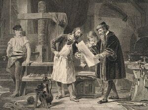
From Johann Gutenberg's first printed Bible to books printed in mid-twentieth century central Europe, a typeface was used that was modeled upon Gothic book hands of the fifteenth century. In this tutorial we will refer to this typeface as Fraktur.
Fraktur is not usually as difficult to decipher as Kurrent and is common in old German documents. Many genealogical records, particularly those produced by the state, will use Fraktur in titles and fields. Fraktur was also used in the books and documents of German immigrant colonies in America.
The Fraktur Alphabet
Below is a full chart of Fraktur Typeface. The numbers 1 to 10 are also shown. You may notice that many letters strongly resemble their counterparts in the Latin alphabet. Other letters may resemble forms from Old English Typefaces. The numbers are virtually identical to their internationally recognized print forms, with no distinguishing characteristics in Fraktur.
If you look at other original sources from Central Europe before 1950, you will find that most printed documents contain these or similar printed letters.

The following pages in this section will describe each letter of the alphabet in detail. Pictures from actual books and documents will be included to show you real examples of each letter. We encourage you to look at these pages and to examine each letter.